InTDS ArchivebyAnna Gordun PeiroI found a hidden gem in Matplotlib’s library: Packed Bubble Charts in PythonEver wished to design those beautiful Tableau based packed bubble charts? Follow along for a tutorial on the Matplotlib solutionJul 28, 20245Jul 28, 20245
InDev GeniusbyDigNo ApeHow to Use Sankey Chart to Report Business Earnings via Python Plotly? NVDA case studyPreviously on How to Use Sankey Chart to report business earnings via Python Plotly? Part 1, Part 2, we used AMD’s quarterly income…Feb 29, 2024Feb 29, 2024
InTDS ArchivebyLee VaughanMake Beautiful (and Useful) Spaghetti Plots with PythonStacked line charts are so hot right now!Aug 16, 20234Aug 16, 20234
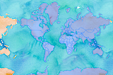
InTDS ArchivebyParul PandeyInteractive Geographical maps with GeoPandasExplore the geospatial data with interactive visualizationsNov 10, 20214Nov 10, 20214
InTDS ArchivebyAvi ChawlaBuild Elegant Web Apps Right From Jupyter Notebook with MercuryNotebooks to beautiful web apps in no timeApr 17, 20237Apr 17, 20237
Soner YıldırımHow to Customize Matplotlib Plots with Tick LocatorsHaving full control over a data visualization is a great feature.Oct 25, 20221Oct 25, 20221
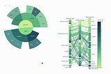
InTDS ArchivebySemi KoenHow To Choose An Effective Visual For Your Data Science ProjectWith a free downloadable guide to help you pick the right one!Oct 18, 2022Oct 18, 2022
InTDS ArchivebyDamien Azzopardi3 Must Know Data Visualization PrinciplesYour data has a story to tellAug 11, 20224Aug 11, 20224
InTDS ArchivebyEryk LewinsonA Simple Way to Turn Your Plots into GIFs in PythonImpress your audience with animated plotsJan 22, 20223Jan 22, 20223
InTDS ArchivebyChristopher TaoProbably The Easiest Way To Animate Your Python PlotsGenerate frames of plots and combine them as GIFApr 26, 20222Apr 26, 20222
InTDS ArchivebyMatteo CourthoudGoodbye Scatterplot, Welcome Binned ScatterplotMay 9, 202216May 9, 202216
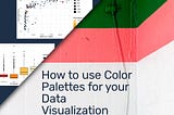
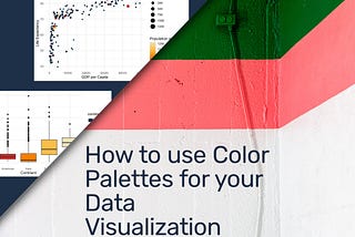
InTDS ArchivebyDr. Gregor ScheithauerHow to use Color Palettes for your Data VisualizationA Step-by-Step Color Palette Tutorial for Seaborn, Altair, and ggplot2 (R)Mar 19, 20224Mar 19, 20224
InTDS ArchivebySusan Maina8 Seaborn Plots for Univariate Exploratory Data Analysis (EDA) in PythonLearn how to visualize and analyze one variable at a time using seaborn and matplotlibMar 30, 2022Mar 30, 2022
InTDS ArchivebyCorey WadeCool Scatter PlotsHow to vary size and color in seabornMar 22, 2022Mar 22, 2022
InTDS ArchivebyMarie LefevreHow to Build Effective (and Useful) DashboardsA four-step approach based on a real-life exampleMar 15, 20225Mar 15, 20225
InTDS ArchivebyAdam SymingtonCreating Beautiful Population Density Maps with PythonMapping where the worlds 7.8 billion humans live with PythonFeb 3, 20224Feb 3, 20224
InTDS ArchivebyPratishArrows in python plotsAn introduction to arrows and text annotations in matplotlib plotsFeb 4, 20222Feb 4, 20222
InTDS ArchivebyAndy LeeForecasting Football Scores With GgPlot2Using Poisson to help visualise football correct scores in RAug 24, 20203Aug 24, 20203
InTDS ArchivebyLiana MehrabyanEmbed Interactive Plots in Your Slides with PlotlyGoing beyond PowerPoint with Spectacle EditorJul 27, 20205Jul 27, 20205